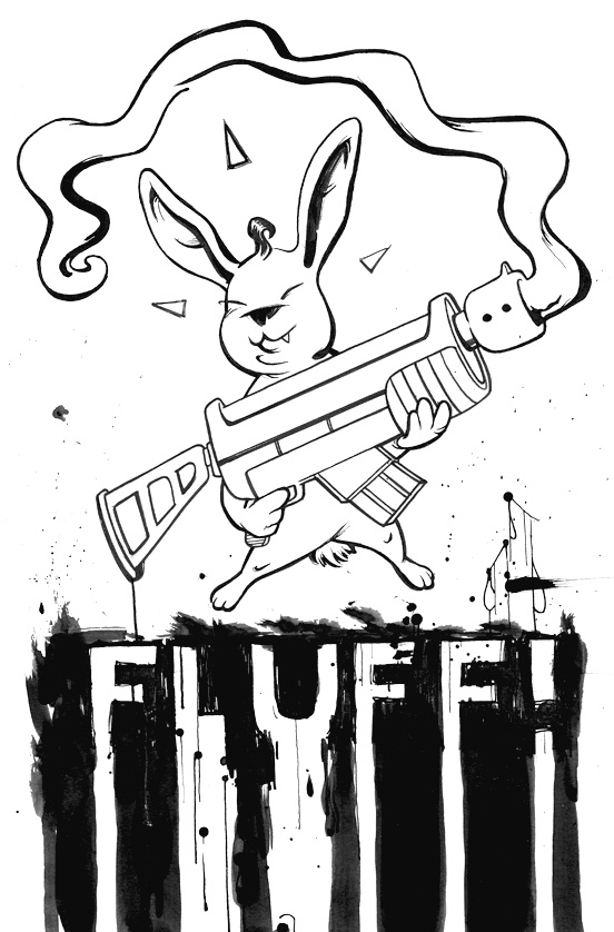
Who knows what I was thinking here... I wanted to create a cool tshirt design but something doesn't work right with this one. Maybe it's my lack of experience with ink nibs. I just couldn't get a nice flow with the strokes. Anyone got any pointers?
I happen to like it. It's actually very differente from the rest of your work. By the way, check out my blog, i would like to know what you think about some recent posts
I'd say you've got two big areas talking totally different languages: the bunny and the typeography. The Bunny is clean and thoughtfully drawn but the type is just smashed under the bunny with a little ink dripped over it. Maybe try to get a broken pen and redraw the bunny carefully with it. Another Point: the black area under the bunny appears to be nearly equal to withe area, there seems to be nearly no contrast to the gunbunny. Whereas the picture part clearly appears more white.
This is all very helpful all, thanks. I definitely feel that the text was kind of arbitrary and not really thought out well. Now I'll try out some of your suggestions. Thanks a mil.

6 comments:
Thin your ink down a touch if you are using the waterproof indian ink, it helps it to flow.
Love your blog by the way. :o)
I happen to like it. It's actually very differente from the rest of your work. By the way, check out my blog, i would like to know what you think about some recent posts
Maybe using a heavy illustration board and wetting it slightly first, that could be interesting.
try simple drawing inks with a thin brush. try rotrings on wet paper if either your paper is wet or your ink is watered down, it'll flow better.
I'd say you've got two big areas talking totally different languages: the bunny and the typeography. The Bunny is clean and thoughtfully drawn but the type is just smashed under the bunny with a little ink dripped over it.
Maybe try to get a broken pen and redraw the bunny carefully with it.
Another Point: the black area under the bunny appears to be nearly equal to withe area, there seems to be nearly no contrast to the gunbunny. Whereas the picture part clearly appears more white.
This is all very helpful all, thanks. I definitely feel that the text was kind of arbitrary and not really thought out well. Now I'll try out some of your suggestions. Thanks a mil.
Post a Comment